Salesforce Seller Whitespace - Featured at Dreamforce
Replaced 13 disconnected tools with one CRM heatmap sellers use to spot territory opportunity.

Role
Lead UX Designer
Cross-Functional Partners
Product, Technical Architecture, Data Insights, Voice-of-Field Sellers
Scope
Enterprise CRM Analytics · Territory & Account Utilization
Impact
Consolidated 13+ tools · Featured at Dreamforce
Core Design Pattern
Progressive Disclosure Heatmap (Scan → Scope → Investigate)
The Friction: 13 Systems, 0 Unified Answers
Before this initiative, account executives and sales leaders had no single place to answer the most fundamental growth question: “Where is the untapped opportunity in this account?”
Sellers were forced to manually query and stitch data across 13+ disparate tools—including Snowflake, OrgSF, Tableau, and Enterprise Data Hub (EDH)—each with conflicting account hierarchies, refresh cadences, and definitions of product ownership.
Legacy dashboards relied on complex, hard-to-parse circle diagrams where products lacking Propensity-to-Buy scores simply vanished from view. Sellers spent hours compiling spreadsheets instead of engaging customers.
Data Fragmentation
13+ disconnected tools required manual data stitching per account.
Inconsistent Mental Models
Disconnected views for Named Accounts vs. Multi-Tenant Organizations.
Low Visual Scannability
Legacy circle charts were unreadable at a glance; unscored products disappeared completely.

Not Owned products surfaced in grey rather than disappearing from the view.
Design Strategy: Hiding Architecture Complexity
Rather than surfacing backend data fragmentation to the user, I partnered closely with Product and Technical Architecture to translate complex backend relationships into a single, governed interaction model. Data from Snowflake, OrgSF, Tableau, and EDH was mapped behind one consistent UI facade.
The final solution
I designed a CRM Analytics experience centered on a heatmap that allowed sellers to scan their territory, isolate meaningful opportunities, and investigate account-level details without switching tools.
Heatmap for ownership and utilization
Layered opportunity filters
Linked Product Footprint, License, and Consumption details

The final CRM Analytics experience: heatmap, filters, and drill-down tables in one view.
Three key design decisions
KEY DESIGN DECISION 1
Consistent Mental Model: Unified Accounts & Tenants Toggle
Sellers operate across two distinct structures: named Accounts in a territory and Tenants for multi-tenant enterprise software licenses. Rather than building separate tools, I designed a unified Account/Tenant toggle that preserves active filters, color scales, and drill-down behaviors seamlessly across both views.
KEY DESIGN DECISION 2
Visual Ergonomics: Graduated Utilization Heatmap
I replaced ambiguous legacy circle charts with a calibrated, graduated heatmap—spanning from “Not Owned” (grey) through “100%+ Utilization” (vibrant green). The color scale underwent rigorous visual scannability testing and WCAG AA accessibility validation with Voice-of-Field sellers to ensure instant interpretation.

The graduated heatmap scale, from not owned through 100%+ utilization.
KEY DESIGN DECISION 3
Progressive Disclosure: Scan → Scope → Investigate
To balance high-density enterprise data with visual clarity, I established a 2-stage interaction pattern:
1. Scan: Sellers view their entire territory as a unified heatmap colored by ownership and utilization.
2. Investigate: Selecting any cell dynamically scopes the Product Footprint, License, and Consumption tables directly below—without losing page context or opening new tabs.
1. Scan

The full territory renders as one heatmap, colored by ownership and utilization.
2. Investigate
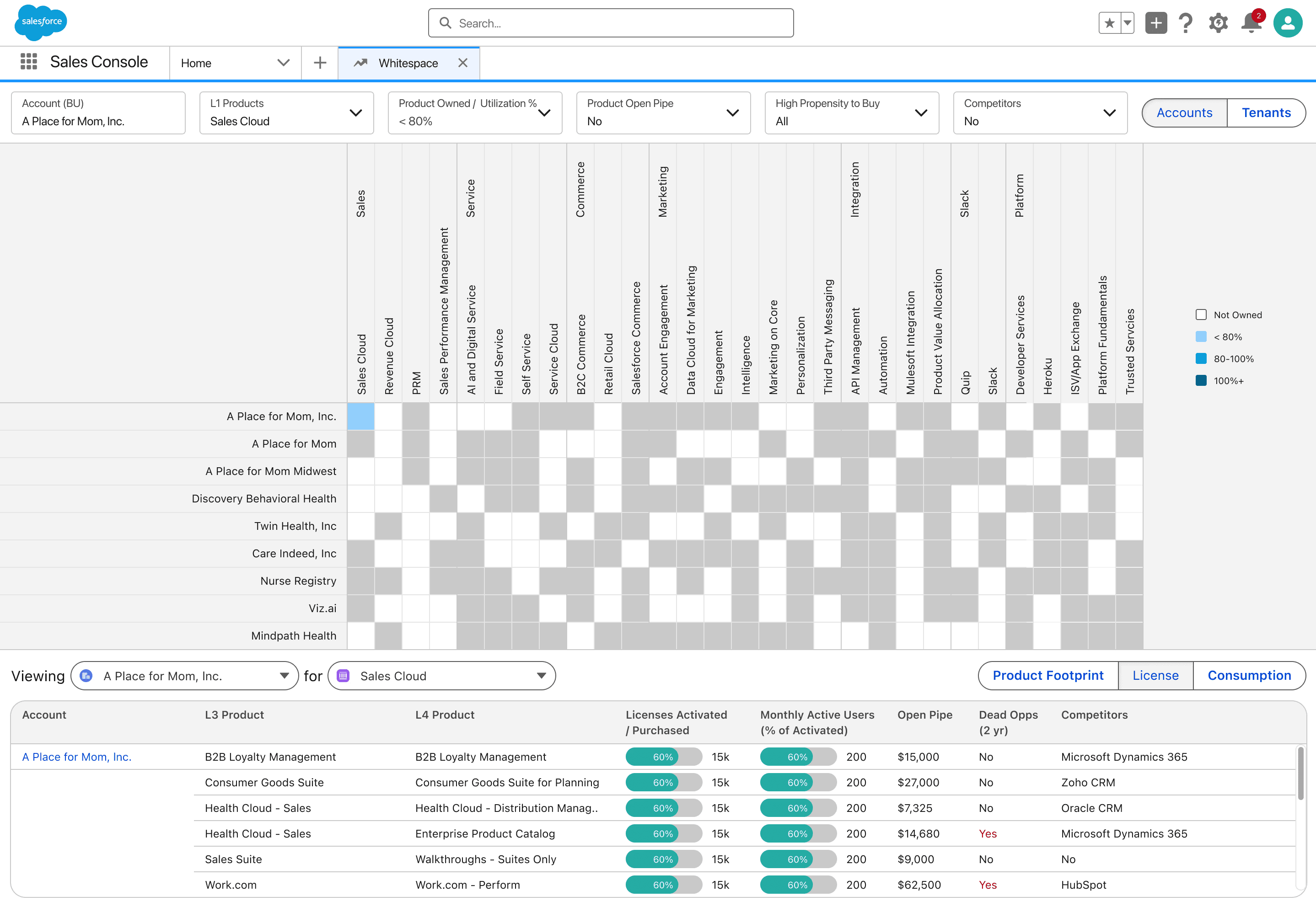
Selecting a cell scopes the Product Footprint, License, and Consumption tables below to that account.
AI SUBSTRATE & FUTURE READINESS
Designing the Substrate for AI Prioritization
The Crawl/Walk release established a clean, governed visualization baseline. By organizing product ownership and utilization data into a standardized heatmap grid, the architecture was explicitly designed to support future AI recommendation layers (such as Salesforce Agentforce).
Proposed future directions layer AI-assisted propensity scoring directly over the heatmap grid—helping sellers see not just where opportunity exists, but exactly which accounts to prioritize first.

Outcomes
Tools Consolidated — replaced with one governed, Voice-of-Field validated analytics experience
Dreamforce
Feature — selected for showcase in official Salesforce sales enablement and keynote materials
Shaped through iterative feedback loops with active Voice-of-Field account executives
This work was also featured in Salesforce Dreamforce sales enablement materials.
Testimonial
Janie built an extensive reservoir of trust on the team through her excellent work, positive attitude, and passion for creating the best possible user experience. She achieves alignment not only through thoughtfully designed prototypes but also through her executive presence and facilitation of design workshops.
Dev Haberman, Technical Architect at Salesforce